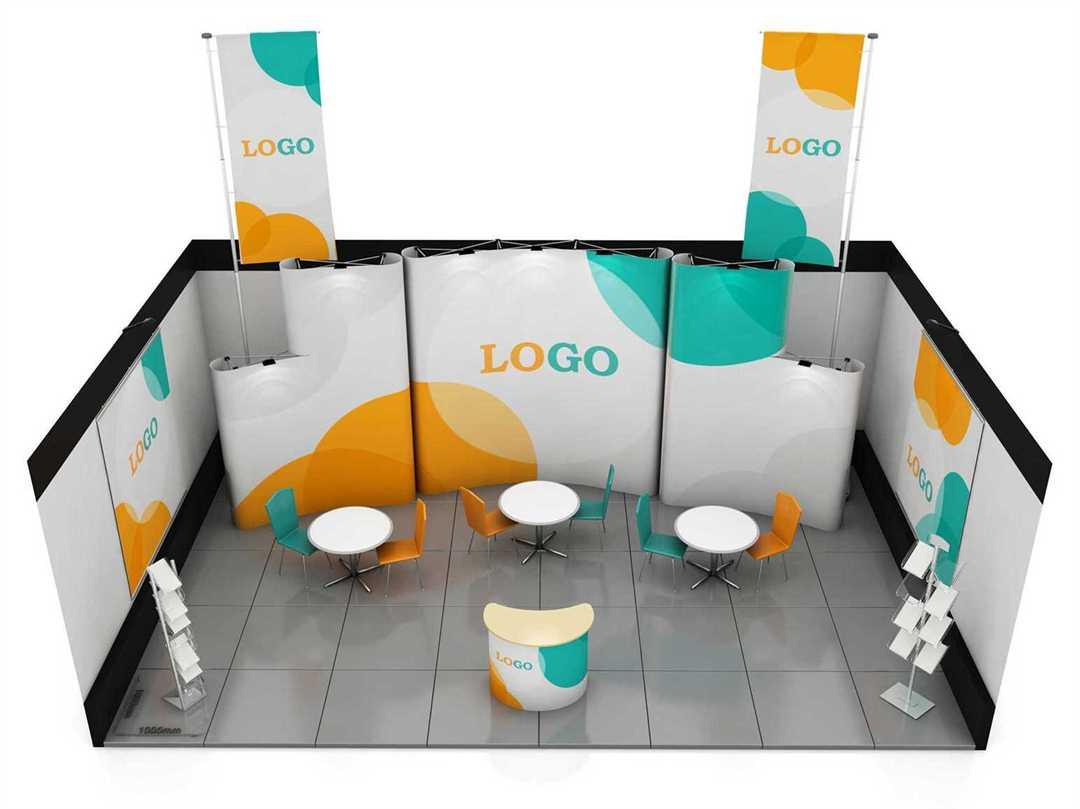
Six Tips for Designing an Effective Banner Stand
If you’re at a big show, you’ll want to attract as much foot traffic to your stand as possible. But this is only possible if your stand appeals to the exhibition attendees. You want your banner to stand out so that not only does it grab attention but also creates impact. Here are six tips from a reputable Winnipeg printing company that can make your banner stand out more effectively:
The Banner Structure
An effective pull up banner stand should follow a proper design structure that prioritizes elements in the right order. An ideal one has four parts: The first part should be your company name or logo. This should then be followed by the value proposition; this is a catchy phrase that explicitly states what value the prospect will get when they use your product or service. Next should be a visual representation of your service and this is where an image will be placed. Lastly should be your contact details; this can include your email address, phone number, and/or physical address.
Colours
It’s been said over and over that colour psychology is real - colours evoke very strong reactions and feelings. Even outside of psychology, the human eye processes colour in certain ways. Your choice, therefore, will impact on how the audience responds to your banner stand. For example, black and white colour schemes will, according to research, capture someone’s eye for two-thirds of a second. Bright colours, on the other hand, can hold one's attention for as long as two seconds. So, if you decide to use a black and white theme, you should use one bright colour to provide a focal point. Using too many bright colours can fatigue the eye and cause people to look away. The bottom line is that you can’t afford to be haphazard when selecting your banner stand colours.
Images
If you’re going to use any images on your banner stand, they should be of high quality. Research also shows that the human mind is drawn to other human faces - no wonder many billboards have a human face on them! If you decide to use a human photograph, smiling faces exude positive responses.
The Message/ Catchy Phrase
When designing a banner stand, less is always more. The aim of the banner is to capture attention as quickly as possible and hold this attention long enough to strike the audience’s curiosity about your products or services. This will not be possible if you flood your banner with too much information. Keeping it short and to the point is the rule of the game. If you want to give your visitors more information, your sales team at the stand will do that, and you can also provide brochures and flyers for takeaway information.
Typography
It’s not enough just to use a catchy phrase. To capture your potential clients’ attention, the choice of font and arrangement should be both readable and appealing. A well-experienced designer will help you with this so you don’t really have to worry about what great typography is all about.
Size of the Banner
What you want to communicate and the size of graphics required to pass the message across will determine the size of the banner. If you’re using the banner solely to advertise, you may want to go with a larger size than you would if you’re using it as a complement to other advertising products. Let your needs guide you on size selection.