The Psychology Of Colour
 Why do so many fast-food restaurant chains use the colour yellow in their branding? Why are stop signs red? And why does nearly every social media logo use the colour blue?
These questions all relate to one concept: colour psychology. 85% of consumers report that colour plays a role in their purchasing decisions.
Even though we see colours in ads and product labels, the psychology behind them often goes unnoticed. If you were comparing two products side-by-side, both with the same price tag and specifications, the colour of the branding may be what will influence your preference.
In the world of business, colour psychology is something you can’t afford to overlook. You can utilize it in your printed materials like posters, signage, and business cards to create effective and memorable branding. Here’s how:
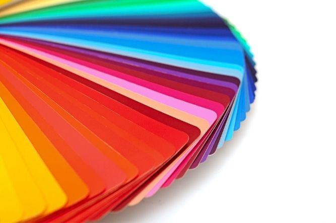
The Effects of Different Colours
One colour isn’t necessarily enough to change someone’s mind about your product, but it will influence how they think about it. Themes and designs play a role in how your advertisements and labels are perceived by others.
Curious about how specific colours affect people? Here are a few colours that you can use to create a certain impression:
Red—for grabbing attention
Red is perhaps the most evocative colour. It symbolizes a range of strong emotions, from anger to passion. We suggest using it sparingly; too much red can come off as overly aggressive.
Blue—for calming & relaxing
From the brilliant sky above us to the oceans that surround us, blue is a colour that reminds us of natural beauty. Pastel shades will soothe, while vibrant blues appear energetic and vibrant.
Yellow—for inspiring hunger & cheeriness
This uplifting and optimistic shade is used to add brightness and warmth to designs. Given how prevalent it is in the food industry, some believe that yellow makes us hungrier.
Pink—for softness & romance
When we see pink, we think of flowers, sweet desserts, and softness. You’ll often see this shade used for marketing tasty treats or products like perfume, makeup, and children’s toys.
Know Your Audience
Colour psychology is one thing on paper, but when it’s used for designing a logo, there are more factors at play.
Context is everything when it comes to using colours. Your industry and brand image play an equally large role in how your design is perceived. The colour green won’t create much of an eco-friendly atmosphere when it’s used for a coal mining company. And if you’re creating promotional material for a spa or massage parlour, stay away from red—it won’t exactly soothe your clients.
The colour combinations that you use also play an important role. For example, red takes on a different meaning when it’s used with black or green—one creates a gothic vibe, while the other reminds us of the Xmas holidays. When you’re drafting a design, be mindful of what concepts or events are associated with various colour combinations.
Looking for help with your next design? Print Pro is a printing shop in Winnipeg. Our graphic designers will work with you to translate your ideas into creative and unique products. To learn more, get in contact with us!